become steadily visible while stabilizing financially.
Biggest Remaining Weakness
Testimonials section
This is the only section that feels slightly less elevated than the rest of the site.
Why:
typography gets dense
spacing tightens
visually less calm
feels more “template-like”
What I’d Eventually Change There
Option 1 (best)
Use:
one stronger featured testimonial
larger typography
fewer words visible
“Read more” expansion if needed
Premium brands usually:
say less
with more confidence
Option 2
Add tiny context labels:
Founder, X Company
Rebrand project
Website redesign
Creates more credibility hierarchy.
Another Smart Improvement Later
Your homepage could eventually use:
ONE thoughtful founder photo of you somewhere.
Not huge.
Not influencer-style.
But premium service businesses buy:
perspective
trust
personality
You are part of the brand more than you realize.
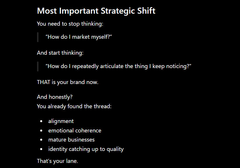
Most Important Feedback
Your site no longer feels like:
“freelance graphic designer.”
It now feels closer to:
boutique strategic studio.
That’s a meaningful shift.
Especially paired with your writing voice.
“I’m starting to think…”
“Lately I’ve noticed…”
“Maybe this sounds dramatic, but…”
“Something I keep seeing with established businesses…”
“I don’t think every branding problem is actually a branding problem.”
“There’s a particular kind of disconnect I keep noticing…”
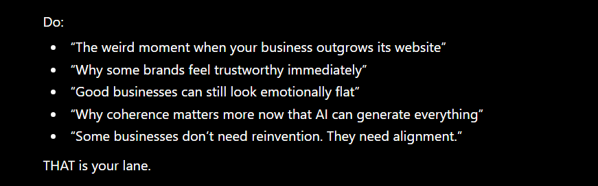
“Some businesses don’t need reinvention. They need alignment.”
“I think businesses can quietly outgrow their branding.”
“There’s a weird moment some businesses eventually hit…”
“Not every outdated brand looks outdated immediately.”
Outreach (Very Important)
Send 5 personal messages this week
Not pitches.
People:
photographers
consultants
copywriters
founders
local businesses
old clients
Simple message:
Hey — we recently launched something called Fresh Start for established service businesses that feel like they’ve outgrown their branding a bit.
It made me think of your work immediately. No pressure at all, but I thought I’d send it your way in case someone comes to mind.
[link]