
How brands win by breaking color psychology rules
Color has a huge influence on our emotions, behaviors, and perceptions. For centuries, designers, marketers, and brands have treated color psychology like a sacred text, using it to craft visual experiences that hit us right in the feels. But sometimes it’s fun to ditch the color hall monitor and go somewhere a little weirder. In this piece, we’re diving into the pull of color, and why ignoring the “rules” can lead to designs that not only get noticed but stick in people’s brains.
Understanding color psychology
According to color psychology, each color comes with its own preloaded emotional software. Blue? That’s the honor-student friend who’s calm, trustworthy, and never late. Red? The one who shows up to the party with tequila and bad ideas. Marketers have milked these associations for decades, quietly nudging our behavior like a hypnotist with a Pantone swatch book.
Green: Flipping the eco script
In sustainable beauty and wellness, green almost always shows up as a soft, pastel hue — the safe shorthand for “gentle” and “natural.” Color psychology says green is calming, and in this space it’s been tamed into a polite whisper.
Aesop flips that entirely, using rich, moody greens that feel premium, grounded, and slightly mysterious. They’re not aiming for “approachable garden,” they’re aiming for “architect’s penthouse filled with plants.”
And Typology? They skip green packaging altogether. Instead, the “green” you notice in their photography comes from fresh mint leaves styled into the shot — a prop, not a brand color. It still triggers the “natural” association, but it does it in a way that sidesteps the predictable pastel-green box entirely.

Aesop’s deep green packaging signals sophistication and nature without defaulting to soft, muted tones. Source: Unsplash.

Typology pairs earthy amber glass with fresh green mint—a grounded, natural cue coming from the prop, not the packaging itself. Source: Unsplash.
Orange: Turning refreshment into a sugar rush
In beverages, orange is usually muted, secondary, or blended with other tones — there to hint at flavor, not dominate the brand. Category norms lean toward icy blues for “refreshing” or earthy browns for “natural.”
Fanta blows that up. Their orange isn’t a supporting actor; it’s the entire stage. Electric, high-contrast, and nearly glowing, it flips color psychology’s “orange = friendly, casual” into something more chaotic and high-voltage. This isn’t refreshment-as-calm — it’s refreshment-as-a-sugar-rush-party.
It’s a deliberate choice to reject the cool, soothing palette you’d expect in drinks and instead own an almost neon orange that feels loud, energetic, and instantly memorable.

Orange as a high-voltage statement—playful, irreverent, and impossible to ignore. Source: Unsplash.
Once you're willing to break boundaries—whether with a deep green, a hyperactive orange, or anything in between—the results can be surprisingly effective.
Breaking the rules
Some brands say, “Yeah, thanks, but no thanks” to the color-psychology handbook. They deliberately veer off course to carve out their own lane.
Take Airbnb. The travel sector usually sticks to spa colors—blues, greens, anything that whispers “relax.” Airbnb, meanwhile, went for a bold pink-to-magenta gradient. The effect is inclusive, modern, and slightly millennial-dream-flat, signaling that they’re about unique stays, not your grandma’s cruise line.
Airbnb’s bold pink gradient breaks the hotel-industry mold of spa blues and greens—proving ‘relax’ doesn’t have to look like everyone else. Source: https://news.airbnb.com/media-assets
Then there’s Rae, the no-nonsense wellness brand that rejected the predictable soft pinks and clean whites of the self-care aisle in favor of a bold, unapologetic purple-and-yellow combo. It’s not trying to whisper “calm.” It’s more like the friend who kicks open your door at 8 a.m. with coffee and gossip—you weren’t ready, but now you’re wide awake.

Rae slaps on a color combo that feels more wake-you-up than wind-down. Source: private photo.
Black: Heavy metal purity
In bottled water, the visual language is almost universally light—sky blues, white caps, sunlit mountains. Color psychology says these shades are calming and clean. Liquid Death? They put water in a black can with heavy-metal typography and a skull. It’s hydration by way of a rock concert, daring you to drink it for the attitude as much as the refreshment.
I drink it all the time, and my favorite part? The looks I get when I walk into training holding what looks like a beer bottle. People do a double-take, and it instantly becomes a conversation starter—exactly what a rule-breaking brand wants.
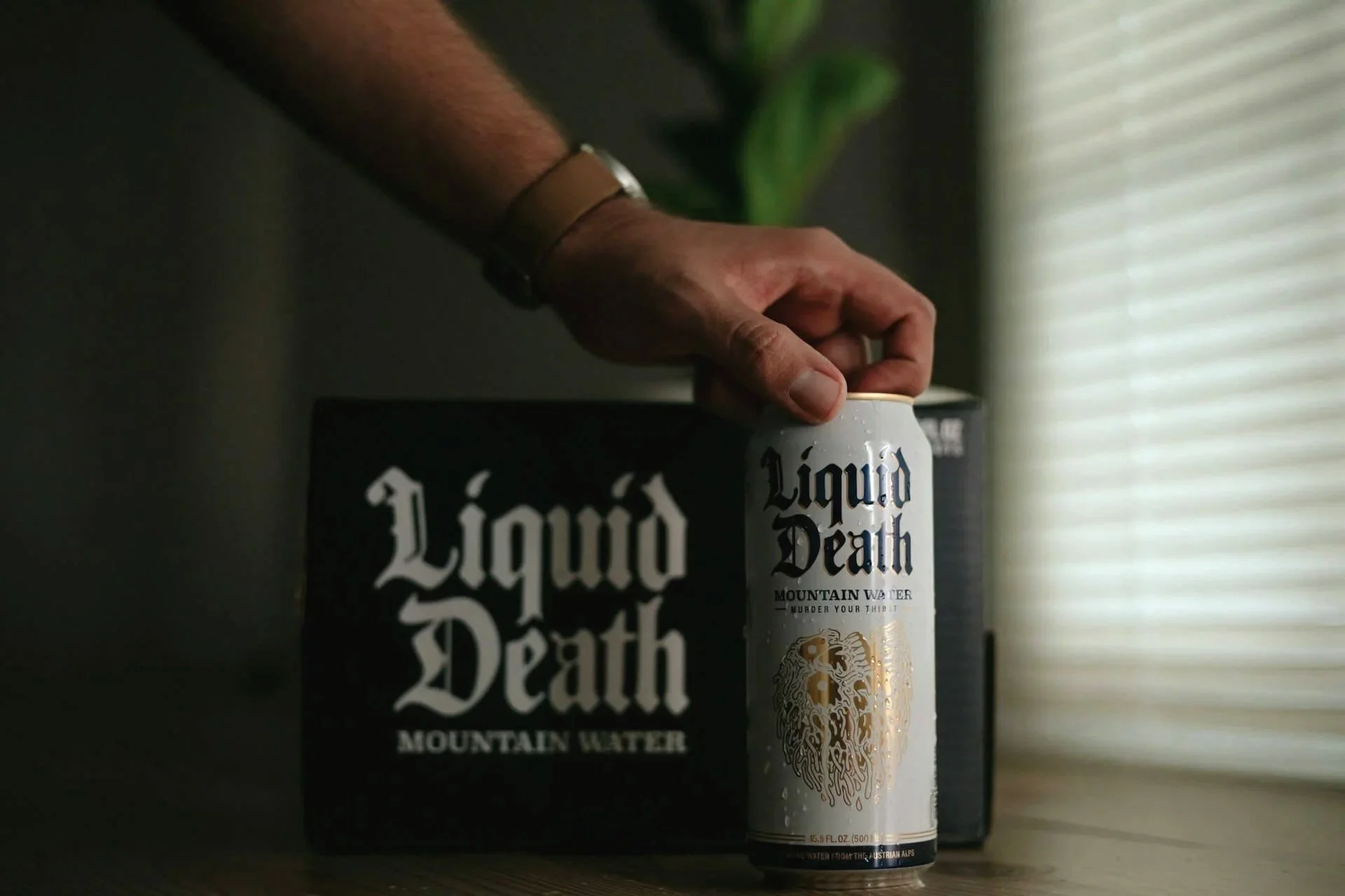
Liquid Death’s black and white cans turn bottled water into a rebellious lifestyle statement—hydration meets heavy metal. Source: Unsplash
Embracing eye-popping combos
Forget matching your colors like they’re sensible shoes. Clash them. Make them argue. Use contrasts so bold they feel slightly wrong—which, in design, often means they’re perfect. The result? Like putting hot sauce on ice cream—unexpected, a little chaotic, and somehow addictive.
Challenging stereotypes
Color psychology loves its tidy boxes: yellow is happy, blue is calm, red is danger. But colors can break character, and you can make them. Dunkin’ does this by pairing neon orange with hot pink — a combo that defies the usual food-and-beverage playbook. It’s bold, high-contrast, and a little chaotic, instantly setting them apart in a coffee market that leans heavily on earthy browns and muted tones.

Dunkin’s neon orange and hot pink wall mural—loud, unapologetic, and unforgettable in a sea of muted café branding. Source: https://news.dunkindonuts.com/news/releases-20180925
Honoring personal preferences
While the theory offers broad strokes, humans are inconveniently individual. A color that screams “trust” to one person might scream “bank I hate” to another. So, yes, think psychology—but also think about your actual audience. It’s like pizza: the menu has “classics,” but someone will always want pineapple and anchovies, and if they’re your paying customer, guess what’s going on the pie.
Contextual reinterpretation
Colors are not one-trick ponies. Yellow can be warm sunshine… or a hazard sign telling you to back up slowly. Play with context, and you can make familiar shades say something completely new. Think of it as wearing sneakers with a tux—people may be scandalized, but they will not forget you.

Yellow at its warmest: sunlit, natural, and full of optimism. Source: Unsplash.

Yellow as a warning—same hue, completely different emotional impact. Source: Unsplash.
Creating emotional rollercoasters
Sure, you can stick with one mood. Or, you can throw your audience’s eyes on a joyride. Blend warm with cool, muted with neon, and see what happens. It’s like a rom-com that suddenly kills off a main character—you’re unsettled, intrigued, and fully locked in.
Championing creativity and impact
Here’s the thing: color psychology is a useful framework, but it’s not the Constitution. Break the rules. Bend them. Snap them in half if it makes sense for your brand. Just keep your choices coherent and connected to your values, so you’re being rebellious on purpose, not because you got lost in the paint aisle.
The truth? Playing outside the lines can lead to the most memorable work you’ll ever make. And in a world drowning in safe, same-y visuals, that bit of risk might be the smartest move you’ve got.
Your turn: Pull up 5 brands in your space. What’s the dominant color in each? Now, imagine flipping it—going deeper, brighter, or unexpected. How could that shift reframe your brand in your audience’s mind?
Seen a color combo that nailed it by breaking the rules? Send it my way via Instagram or email—I’d love to save the wildest ones.
