
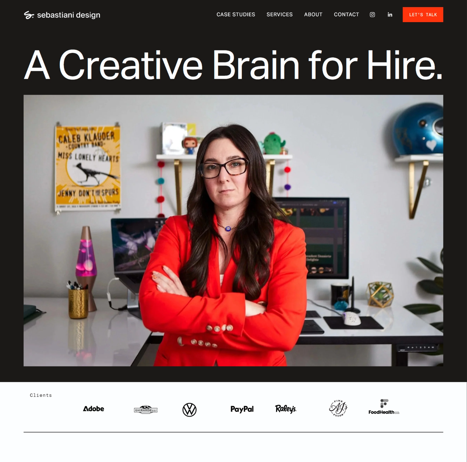
homepage mockup here
Repositioning an art director as a creative brain for hire
PROJECT
Brand strategy
Positioning
Visual identity
Website design
Backround →Amanda Sebastiani is an experienced art director with years of agency, brand work and creative team leadership behind her. While the work itself is strong, her online presence still functioned like a traditional portfolio—one designed to attract recruiters rather than collaborators.
The work communicated experience. The brand didn’t yet communicate perspective.
the problem →The portfolio created several unintended signals:
Projects organized around past employers
Messaging centered on job history
Visual identity that felt neutral and corporate
No clear invitation for collaboration
A platform built like a résumé rather than a practice
Amanda was hiding behind her work, something many designers do. We’re taught to let the work speak, instead of showing how we think, lead, and make decisions
Result
Amanda appeared as a candidate rather than a creative partner.
Strategic Shift →From Portfolio to Practice

Before: Portfolio site After: Creative practice platform
Instead of laying out a timeline of past roles, the brand positions Amanda as what she actually is—a creative partner. Someone teams bring in when they need perspective, direction, and clear creative leadership.
This shift went beyond a visual update. It meant rethinking how her work—and her thinking—are presented.
The goal was simple: move from past roles to present value.
To get there, the case studies were rebuilt to show the thinking behind the work—the challenge, the decisions, and the outcome—so you see not just what was made, but how Amanda approaches problems. The portfolio was also pared down to a smaller set of strong, representative projects. Less work, more clarity.
The site now invites collaboration more naturally, without rigid packages—making it easy for teams to bring Amanda in based on what they actually need.
Together, these changes shift the site from a gallery of past work into something much more useful: a platform that shows how Amanda thinks and leads.
Not a portfolio—a practice.
A big part of this shift was also more personal. Amanda was hiding behind her work—something most designers do. We’re taught to let the work speak, instead of showing how we think.
But that’s where the real value is.
Once that flipped, everything else followed. Because when you are the offering, the brand has to carry presence—not just polish, but a clear point of view.
design direction →csad?
Because Amanda herself is the offering, the identity carries more weight. It’s what makes her presence recognizable and memorable.
The system balances restraint with distinction—clear typography, strong structure, and an editorial sensibility that mirrors how she approaches her work.
Nothing feels decorative or excessive. Every element is there to support clarity and perspective.
Rather than relying on trends or visual noise, the identity leans into a few core ideas: an editorial feel that signals thoughtfulness over self-promotion, typography that communicates confidence and authority, and structured layouts that reflect the logic behind her thinking. A restrained palette keeps the focus where it belongs—on the work and the ideas behind it.
The result is a system that feels deliberate, recognizable, and quietly confident.
Then show:
logo
typography
website layouts
case study pages
work presentation →The website reinforces this repositioning—shifting Amanda from a candidate to a creative partner.
Projects appear as structured case studies that guide readers through the work, from context and challenge to key decisions and outcomes. Instead of just showing final visuals, each project makes the thinking behind them clear.
The portfolio focuses on a smaller set of strong projects, giving each one the space and clarity it needs to communicate real value.
The site opens up more flexible ways to collaborate. Rather than relying on predefined packages, it invites conversation—reflecting how creative partnerships actually work.
The result is a website that functions less like a portfolio and more like a platform for collaboration.
outcome →The new brand reframes Amanda’s role—from candidate to collaborator.
Instead of positioning herself as someone seeking a role, she shows up as a creative partner teams bring in when they need experienced direction.
That shift is already changing how she’s perceived—conversations start from a place of clarity, her expertise comes through more naturally, and the platform supports collaboration rather than employment.
Sometimes the work doesn’t need to change—only the frame around it.


Client outcome"When the creative mind is the offering, the brand needs to carry presence."
Allie Rigby—Founder, Sunlight Editing
Result: Confident launch and aligned website